My recent agency, KHJ, is one of the few agencies in New England that specializes in real estate and hospitality marketing. For six years, I was the lead writer on many of our accounts, gaining a wealth of experience in this category. Projects included brand development and copy across digital and print media, property naming, broker and tenant presentation materials, and event planning.
Located in Boston’s Seaport district, The St. Regis Residences was the first residential property from the famed luxury hotel brand. As the lead copywriter on the account, I helped develop the brand and all materials to launch the property to brokers and potential residents. Focusing on the highly curated and extravagant living experience the property provides, we developed the theme “Live as you wish”. Our advertising campaign featured surreal fantasy vignettes of residents indulging in their wildest whims – from swimming in a pool full of lilies to standing in a room full of champagne. Our website and collateral material featured alluring imagery and copy that romanticized the St. Regis experience. Against our competitors' conventional approaches, the St. Regis Residences brand stood out and intrigued potential residents about the life that awaits them within this property. Within a month of launch, our campaign created an immediate buzz around the new property and inquiries exceeded our target goal…just as we wished.


The Harbor Garage Project was a development concept by one of our clients to convert their huge parking garage on the Boston waterfront into a combination public space, mall and tower for residential and commercial property. While many people approved of the project, it was met with resistance by neighboring businesses and local residents who wanted to protect the area from overdevelopment. Our client charged us with creating a social media campaign and website to garner more public support. To change the perception that this development might be a concrete monstrosity on the waterfront, we created the theme “Open Up” with its double meaning and focus on the property’s abundance of open-air public space, innovative architecture, and fun activities. Our website featured a marquis of beautiful renderings, an interactive panel highlighting different design features, and an online petition for support.


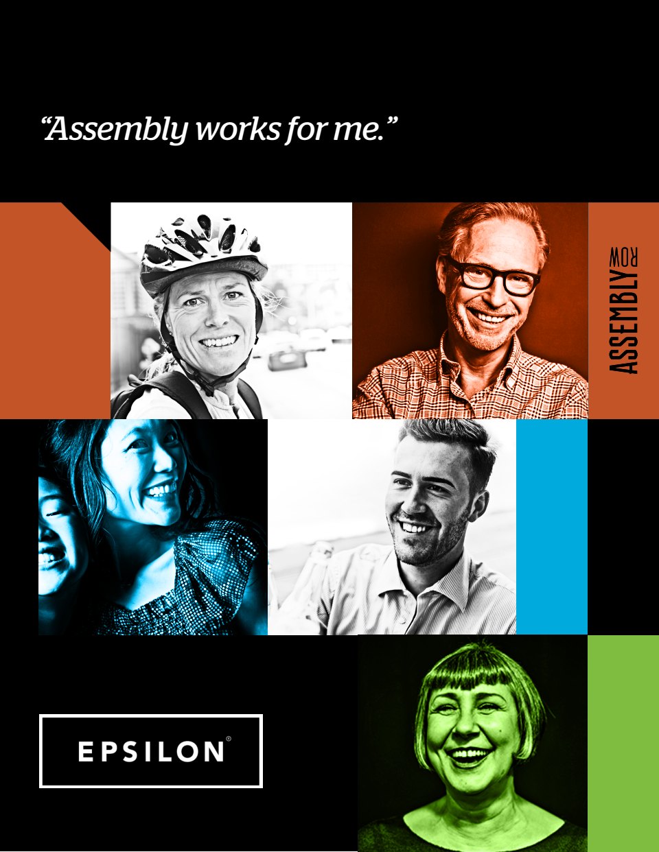
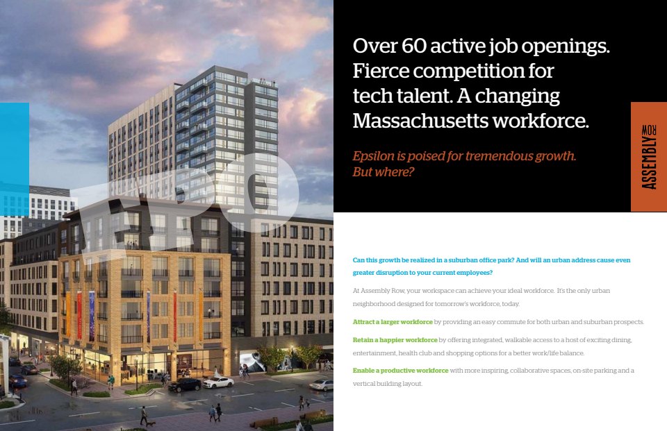
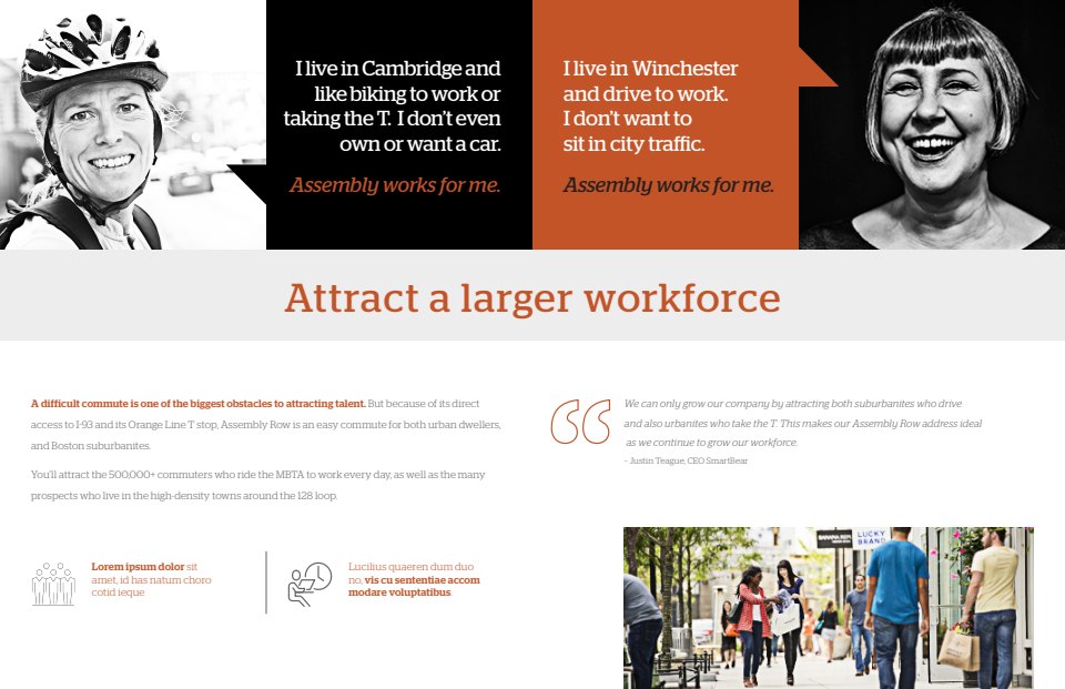
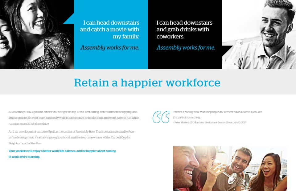
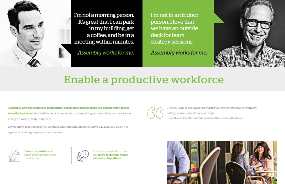
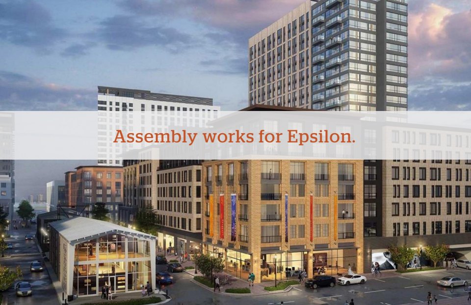
Assembly Row is a popular mixed-use urban village just outside Boston that includes retail outlets, restaurants, condos, commercial property, and even its own subway stop. Our client wanted to attract large, established companies to its commercial space, and asked us to create a customizable presentation piece. We positioned the property as a place where companies could attract and create a larger, happier workforce because of its easy commute for both city dwellers and suburbanites, and easy access to a diversity of amenities. Our concept was to show a range of people who have different workplace priorities, but who share the common sentiment: “Assembly works for me”.
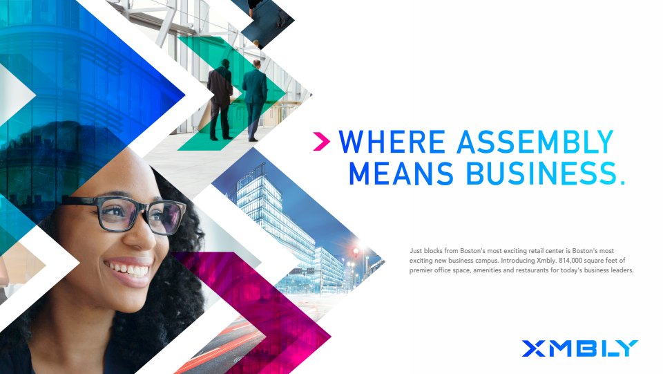
Another one of our clients saw the potential for commercial space at Assembly Row and developed a sprawling 800,000 square foot business campus on the perimeter. Our strategy was to leverage the equity of Assembly Row but give the property its own distinctive brand around its business focus. I came up with the name “Xmbly” and the tagline “Where Assembly Means Business”, which we married to a cutting-edge design.
While the property was under construction, we proposed this teaser billboard next to the construction site along one of our major expressways. Our original idea was to begin with the letter X and spell the name out over the course of several weeks, with the subline “The eXcitement is building”. Due to budget and logistical issues, however, we scaled it back to the board below, and the subsequent follow-up board when construction was completed.


As Boston’s first luxury resort and casino, the arrival of Encore Boston Harbor was one of the biggest news stories of the late 2010's. As part of the team assigned to develop the brand and launch the exciting new resort, I created copy for their website and collateral materials. On opening day, over 50,000 people showed up.


Our client Synergy Investments was challenged with marketing a group of five buildings around a block in Downtown Crossing (also known as DTX), a busy neighborhood in the heart of the city. Instead of marketing the properties individually, our strategy was to treat the entire block as one dynamic community of innovation, collaboration and urban action. We named it “The Hive” – a name that evoked the collaborative energy of its offices and common spaces, and lent itself to a distinctive honeycomb design for marketing materials and environmental branding. The tagline “Where DTX Connects” suggested the Hive is where people and ideas converge in Boston’s most vibrant neighborhood. Below are a few pages from our website and brochure.


Nordblom develops and manages numerous properties in the Boston metro area, but they needed a more distinctive brand image to stand out from the competition. We learned that Nordblom devotes a lot of time to understanding tenants and designs properties to meet their needs and follow emerging trends. From this core insight, we built a brand around the tagline “Start with people, and see what develops”. Our website begins with a tight photo of people in a property rendering, which quickly turns into a photo of the actual property upon scrolling.


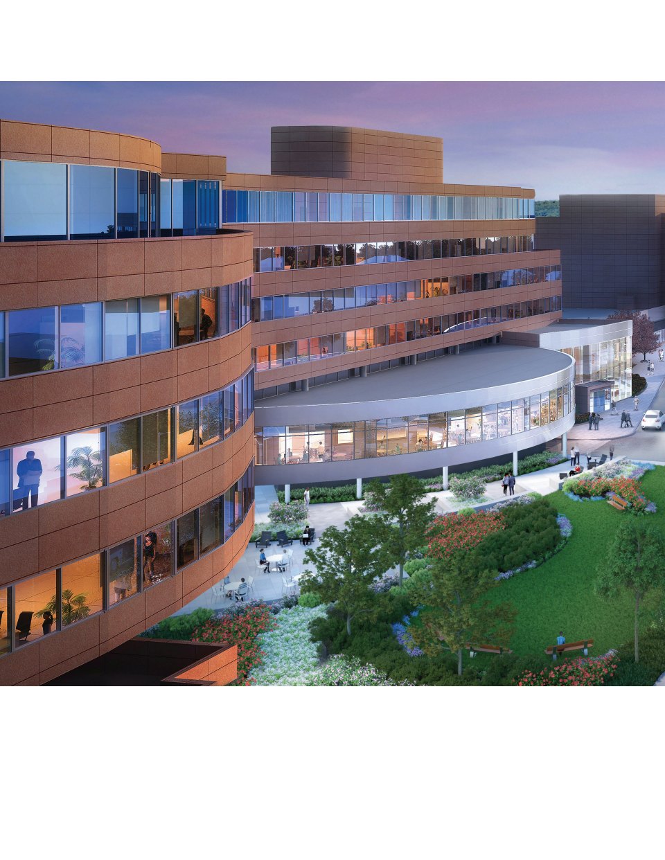
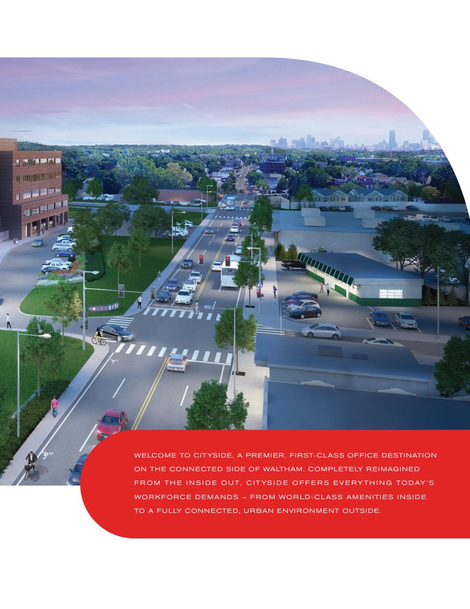
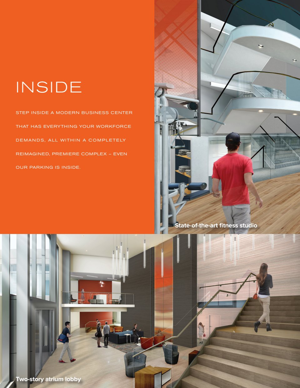
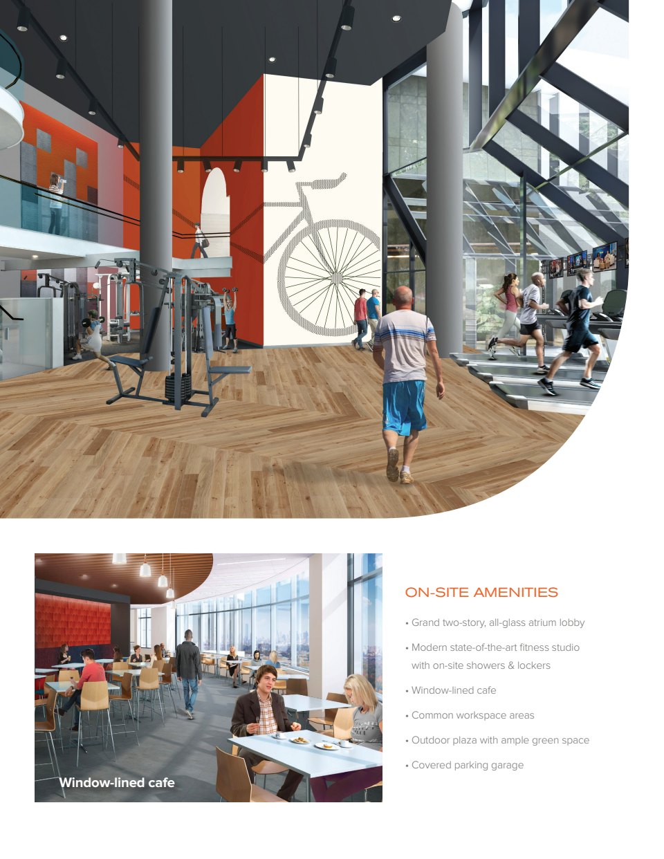
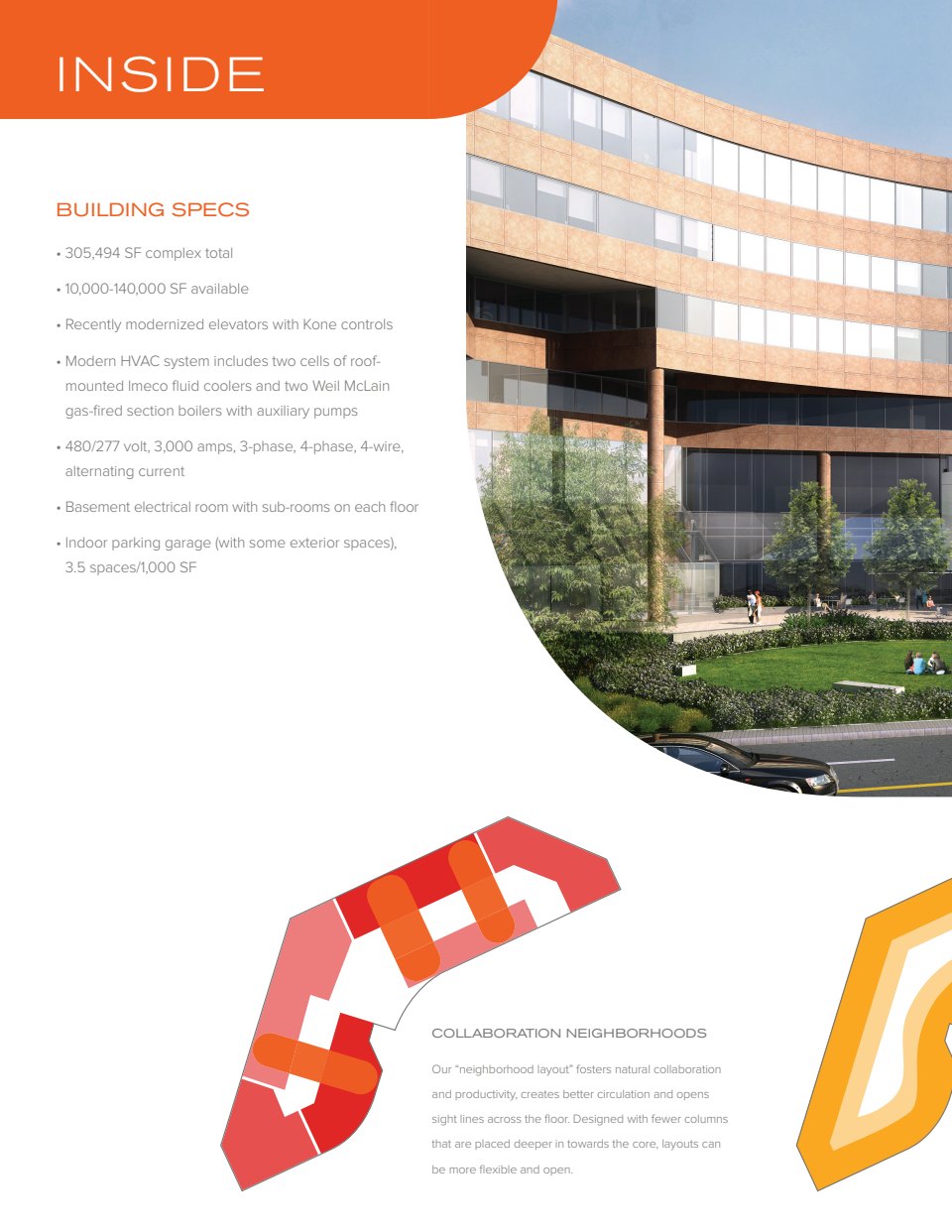
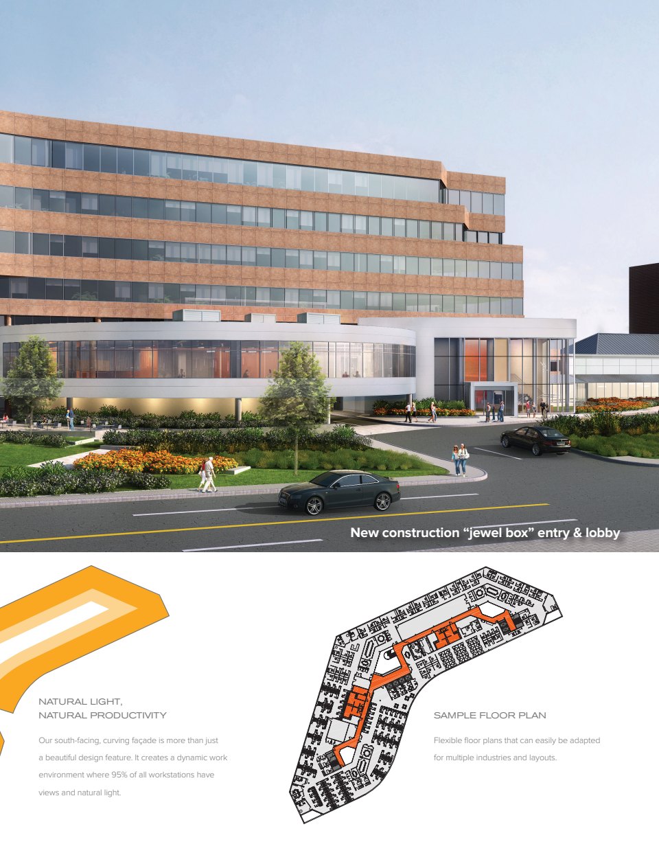
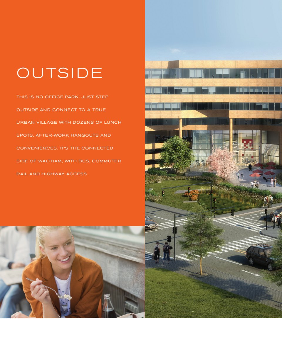
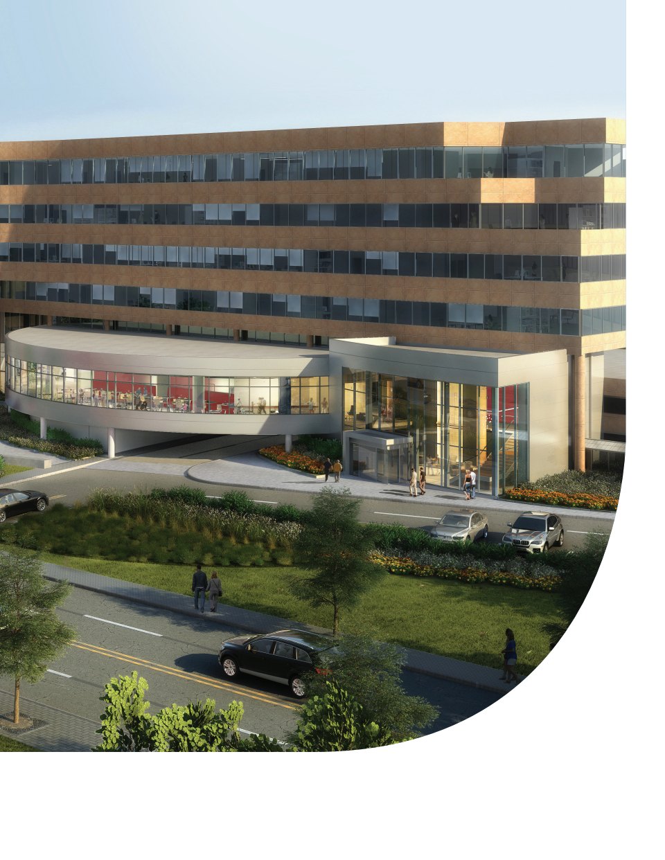
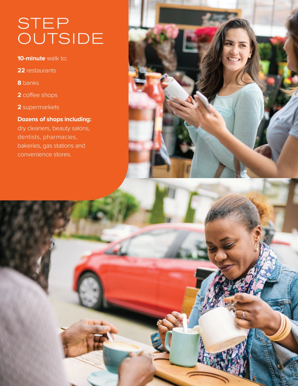
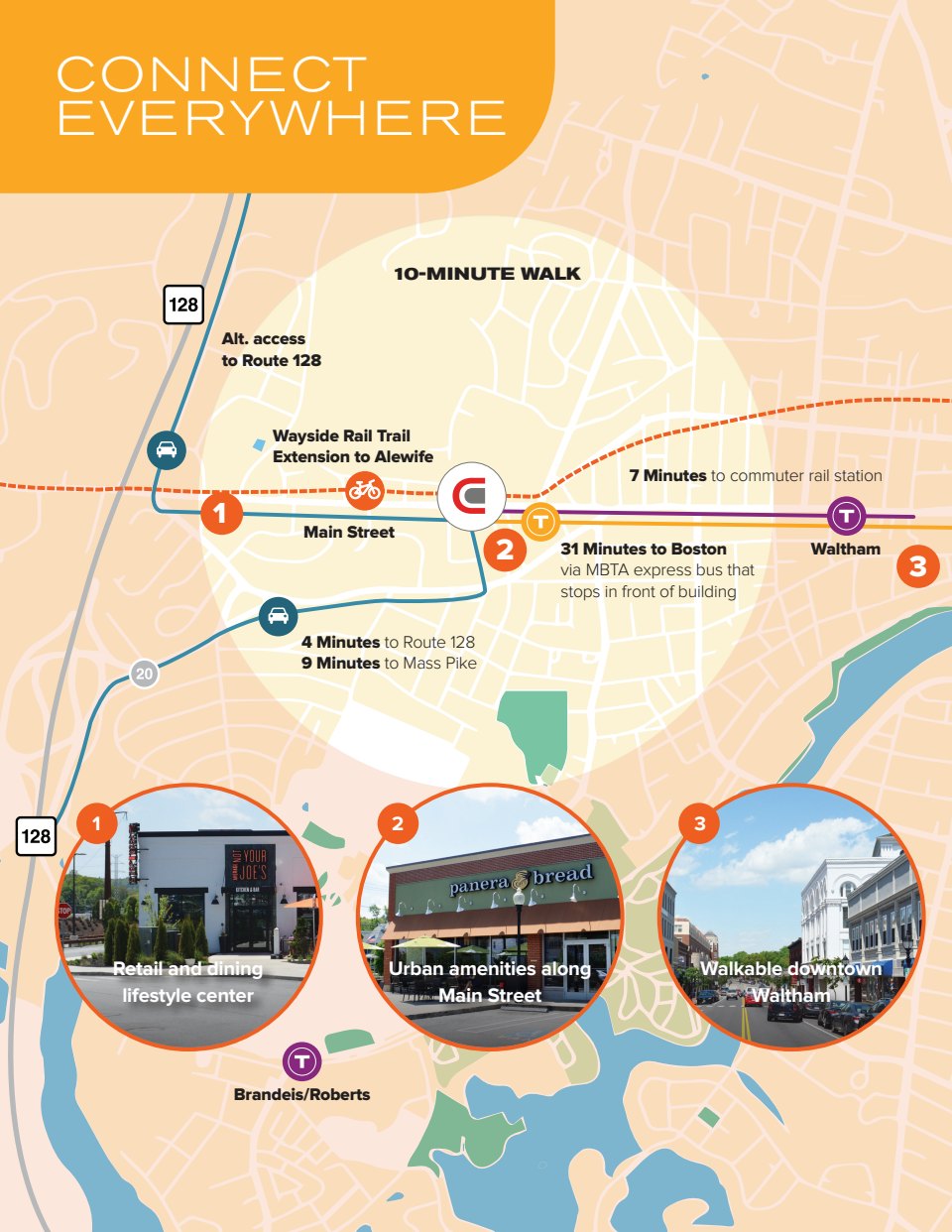
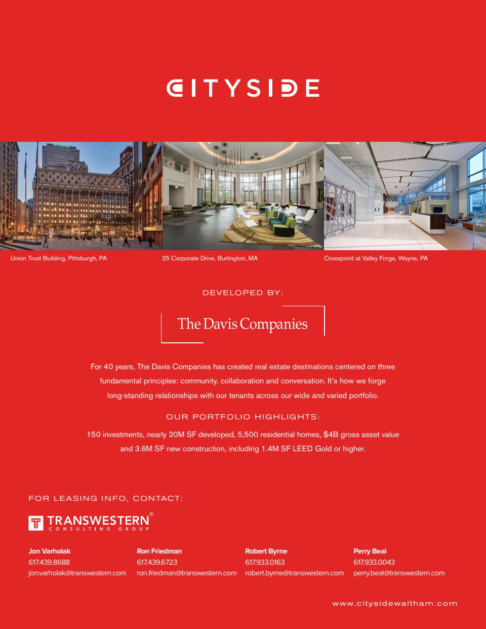
Our client, The Davis Companies, had a renovated commercial property in Waltham, a town outside Boston that was viewed more as a ho-hum suburb with office parks than a fun urban environment with cool properties. Our challenge was to make the property more appealing despite the town’s boring reputation. Because the property was on the city-side of Waltham in an area that felt more urban, we named it “City-Side” and focused on its contemporary design, close proximity to Boston and more urban-feeling surroundings.